
Lessons Learned From Our Listing Photos
Today, I thought I'd share some of the images from our listing - what can I say, they are just SO much better than I could ever take on my own. But, they also show a totally different perspective on the house and how to feature it so it appeals to the masses. Lots of lessons to be learned here.
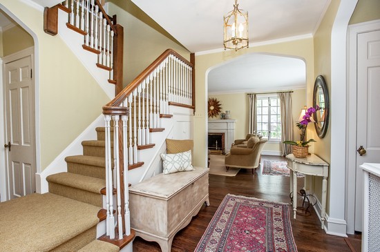
Just check out this foyer image, as taken by the professional photographer. Minimal accessories, neutralized decor and loads of open space. I never knew it could look so good!
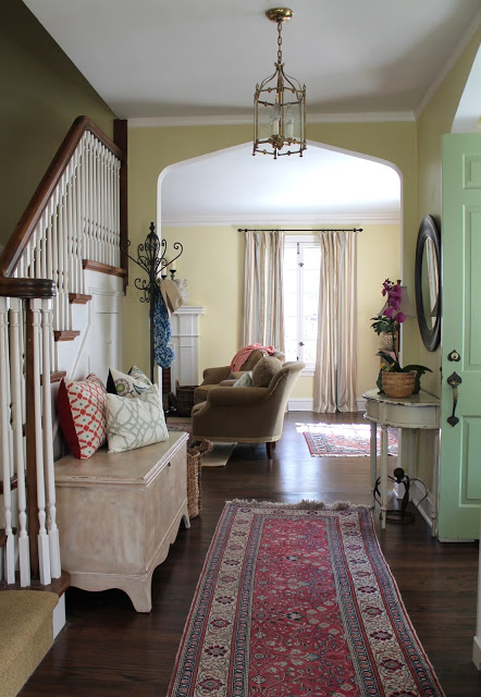
Here's my photo - more colors, more stuff, darker - the whole area appears more closed off and small.
Again, the professional image - notice: limited throw pillows, no layered rugs, limited accessories. Their rule of thumb was no more than 3 items per surface. That's a hard one for a girl like me to follow :)
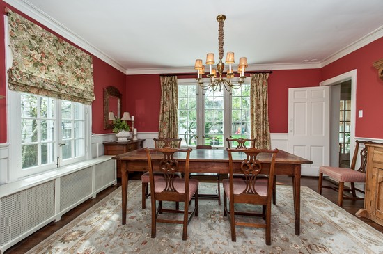
The dining room. This one is pretty true to form, but certainly highlights the value of a nice wide angle lens!
I have to tell you when I came home after the photos were taken, I could tell things had been moved around, etc. The waiting game to see the finished images was killing me...
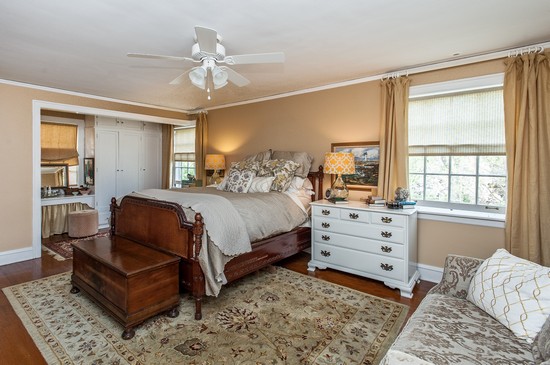
The bedroom looks huge!
When I first saw the pictures I didn't like them at all. Probably because they were so much more neutral than the house in person. But, our real estate agents kept telling us that we had to treat the house like a product and to take the emotion out of it. Very true, but easier said than done sometimes!
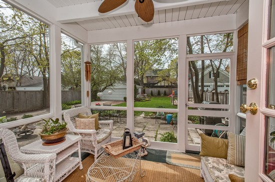
We've been spending a lot of time on the porch lately. Meals, playtime, coffee in the morning, after dinner drinks. This could be the room I will miss the most!
Speaking of missing things - I've got a whole post planned of our favorite hot spots. Will be sharing soon. I know my posts are kind of random and not exactly timely right now, but I appreciate you sticking with me during this transition time!
until next time,