
Big Girl Room: Stage 3
As you know, I have decided to focus most of my energies on completing the Big Girl Room (catch up here). So far all has been going a little too easily; I've found the right pieces and started to develop a plan and feel for the room. It's heading down the eclectic, shabby chic, vintage country route - think washed out quilts, hand painted furniture that looks like it's been collected over time, etc, etc.
And I've been pleased so far.
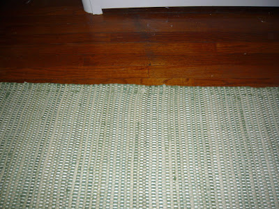
When it came to the rug, I didn't want to make too big of an investment - this is a kid's bedroom after all. I wanted something soft underfoot, with a light pattern to hide the inevitable dirt and stains, but nothing too grown up. After one purchase and return from HomeGoods, I came across this lovely green rag rug from Pottery Barn and it fit all of my criteria. Sold. I like how it picks up the green from the curtains and takes the emphasis away from the blue walls.
So, when I got the email from Pottery Barn with a link to their bedding sale I was quite excited! On clearance I found two Euro Shames in a vintage inspired quilt featuring all my colors! And at $14.99 a pop, I knew it was a steel and ordered two immediately!
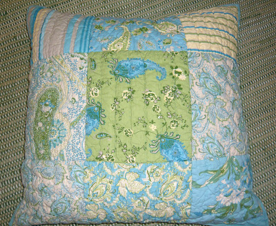
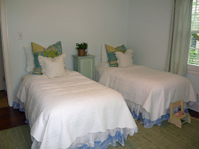
It looked perfect...online. When they finally arrived, I loved them; perfect with the walls, carpet, curtains, etc. But when I got them on the beds - not so much. The cute periwinkle bed skirts look horrible. The blue in the sham is much more of a teal/turquoise and definitely not the direction I had originally intended.
And I've been pleased so far.
When it came to the rug, I didn't want to make too big of an investment - this is a kid's bedroom after all. I wanted something soft underfoot, with a light pattern to hide the inevitable dirt and stains, but nothing too grown up. After one purchase and return from HomeGoods, I came across this lovely green rag rug from Pottery Barn and it fit all of my criteria. Sold. I like how it picks up the green from the curtains and takes the emphasis away from the blue walls.
Now, feeling really smug I moved onto bedding. I decided that I just wanted a couple of accent pillows for the beds; to keep things simple - trying to keep my 'client' in mind.
I did the usual laps through Target, HomeGoods, Bed Bath and Beyond, Pottery Barn Kids, Land of Nod, etc. and came up with nothing. It was proving to be incredibly difficult to find green, blue and yellow bedding for kids - everything was blue and red for boys or pink and purple for girls!
So, when I got the email from Pottery Barn with a link to their bedding sale I was quite excited! On clearance I found two Euro Shames in a vintage inspired quilt featuring all my colors! And at $14.99 a pop, I knew it was a steel and ordered two immediately!
It looked perfect...online. When they finally arrived, I loved them; perfect with the walls, carpet, curtains, etc. But when I got them on the beds - not so much. The cute periwinkle bed skirts look horrible. The blue in the sham is much more of a teal/turquoise and definitely not the direction I had originally intended.
Fortunately, I am a roll with the punches kind of girl, and the more I look at those shams, the more I liked the teal/turquoise. Especially after the bedside cabinet was added, which incidentally used to serve as our medicine cabinet in London and has since sat under-appreciated in our guest room.
So, now it's back to square one when it comes to accessories, lighting and bed skirts!
Do you agree - would you have chosen the blue in the shams over the blue in the bed skirts?